Showing posts with label data. Show all posts

Wednesday, October 1, 2025

October 2025 Science Summary

Puppy party

Greetings,


I've got a mixed bag of four mostly unrelated science articles this month.

If you know someone who wants to sign up to receive these summaries, they can do so at http://subscribe.sciencejon.com (no need to email me).


CLIMATE CHANGE:
Chen et al. 2025 reviews the evidence (from 21 studies with at least 10 years of data) that climate change may cause 3 problems (see Fig 1): mountaintop species going extinct when conditions become too warm for them, species not able to move upslope as fast as conditions change, and bottomland diversity declining b/c no warm-tolerant species can replace areas abandoned by species moving upslope. Using a model they found that mountaintop extinctions are not happening more than expected w/o climate change, many species ARE moving upslope but rarely having range contract, and only limited homogenization of bottomland species. They note including moisture changes and nitrogen deposition could have changed the results, and more research is needed to figure out why these problems are occurring in limited cases.


FOREST CARBON:
Schnabel et al 2025 has experimental evidence that after 16 years, planted forests in Panama with a mix of 5 native species sequestered 57% more aboveground carbon than monocultures. Both treatments lost soil carbon relative to the pasture they started with (see section 4.3 for possible explanations) but still gained a net of 24.7 t C / ha (90.7 t CO2e/ha) due to the aboveground gains. See  https://news.mongabay.com/2025/04/diverse-forests-and-forest-rewilding-offer-resilience-against-climate-change/ for more.


DATA AND DEFORESTATION:
Roquette et al. 2025 is ostensibly about the technical details around land use mapping in Mato Grosso, Brazil. But it actually makes a much broader point: boring things like data sources and algorithms used can have an outsize backdoor policy impact. They argue that a shift in how land use was classified could sneakily allow a ton of deforestation. Basically by changing how "forest" is defined and reclassifying some forest as a type of savanna (confusingly, cerrado is an ecosystem but the Cerrado is a biome / region), this could allow deforestation since 80% of forest has to be set aside from development but only 35% of savanna does. In some cases the new map actually does the reverse (classifying what was savanna as forest) but that can be reversed upon request. The worst case scenario is that up to 4,1 million ha could be authorized for deforestation.


MINING AND TOXICITY:
Foerster et al. 2025 found that giant otters in the Pantanal are showing evidence of mercury contamination in the Pantanal – higher when they’re closer to gold mines (except for streams close to the mine over land but not connected by water). Their results aren’t conclusive but it seems likely that the values are high enough to be causing toxicity, and that otters aren’t able to flush out the mercury by molting their fur, nor by having selenium bind to the mercury. They measured mercury in fur rather than directly in the liver, but based on other research they think it’s likely levels are high enough in some animals to cause serious toxicity and perhaps even death. 


REFERENCES:
Chen, Y.-H., Lenoir, J., & Chen, I.-C. (2025). Limited evidence for range shift–driven extinction in mountain biota. Science, 388(6748), 741–747. https://doi.org/10.1126/science.adq9512

Foerster, N., Soresini, G., Leuchtenberger, C., Bócoli, D. de A., Paiva, J. de B., Brait, C. H. H., & Mourão, G. (2025). Pervasive mercury contamination of a semi-aquatic apex predator across the Pantanal wetland. Environmental Conservation, 1–6. https://doi.org/10.1017/S0376892925100155

Roquette, J. G., Vacchiano, M. C., Daher, F. R. G., & Finger, Z. (2025). Pseudo-legal deforestation due to changes in the classification of native vegetation in Mato Grosso, Brazil. Environmental Conservation, 1–7. https://doi.org/10.1017/S037689292510012X

Schnabel, F., Guillemot, J., Barry, K. E., Brunn, M., Cesarz, S., Eisenhauer, N., Gebauer, T., Guerrero‐Ramirez, N. R., Handa, I. T., Madsen, C., Mancilla, Lady, Monteza, J., Moore, T., Oelmann, Y., Scherer‐Lorenzen, M., Schwendenmann, L., Wagner, A., Wirth, C., & Potvin, C. (2025). Tree Diversity Increases Carbon Stocks and Fluxes Above—But Not Belowground in a Tropical Forest Experiment. Global Change Biology, 31(2). https://doi.org/10.1111/gcb.70089


Sincerely,
 
Jon
 
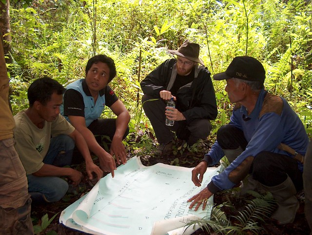
p.s. These four foster puppies were getting some wiggles out in my yard before a "puppy party" which raises money for an animal rescue (Homeward Trails) and helps them find homes

Friday, July 1, 2022

July 2022 science summary

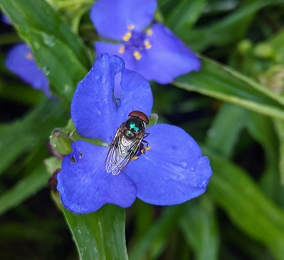
Bromeliad fly (Copestylum) on spiderwort (Tradescantia)

Hello,


This month is another grab bag: one paper on equity in fire management, two on biodiversity data, one asking how much conservation has helped species, and one pretty bad one on how ag practices impact nutrients.

If you know someone who wants to sign up to receive these summaries, they can do so at http://bit.ly/sciencejon (no need to email me).

FIRE MANAGEMENT:
Anderson et al. 2020 found that rich white communities who had a fire nearby tend to get additional prescribed fire (even when not needed). This is partly due to their ability to self-advocate at relevant planning meetings. It raises equity and social justice concerns about how we could instead base fire management on factors like social and/or ecological vulnerability. As context, here is a map showing how wildfire risk varies across the U.S.: https://www.nytimes.com/interactive/2022/05/16/climate/wildfire-risk-map-properties.html


BIODIVERSITY DATA:
Saran et al. 2022 has a good overview of biodiversity information portals, 16 global (Table 1) and 5 country-specific (from Australia, Canada, India, and the U.S., Table 2). It's a great complement to Nicholson et al. 2021 (an overview of ecosystem indicators) by providing actual data sources and some info about what each portal includes. The paper certainly isn't "comprehensive" as the title advertises, but it's a great start and I learned about some new useful resources by reading it.

Before threatened species can get protection, they need to be assessed to document how vulnerable they are. But there is a substantial backlog of species waiting to be assessed. Levin et al. 2022 offers a fairly simple (but ultimately unsuccessful) way to re-prioritize unassessed species for the IUCN red list to allow a better chance of assessing the ones that are in trouble so they can get protection. They use a rapid estimate of "extent of occurrence" (the species' range and spatial distribution of threats) as a proxy for vulnerability. At first it's exciting to see that it was 92% accurate at identifying which species were of the Least Concern (showing potential to flag species not worth assessing). But two questions are more relevant (and Fig 1 has the answers): what % of vulnerable species does it correctly recommend assessing (40%) and what % of recommendations for assessment are for species that are actually vulnerable (23%). The discussion has interesting notes on some of the aspects that confused the model (like 5 ash app threatened by Emerald Ash Borer and the American Chestnut threatened by blight) - widespread spp. hit hard by invasives are challenging to accurately assess using simple approaches like this. Hopefully the next iteration of the tool will be more successful, if they could substantially reduce false negatives for vulnerable species it could provide assessment priorities directly, or if they could substantially reduce false positives for vulnerable species it could help by indicating species that likely shouldn't be assessed.


CONSERVATION IMPACT:
Jellesmark et al. 2022 is a global (see Fig 1 map) preprint looking at how conservation has impacted targeted vertebrate species (by comparing pairs of populations targeted for conservation with those in the same country that did not receive conservation attention). I honestly don't know enough about the underlying data source (Living Planet Database) to speak to the reliability of their results (I'll wait for peer review for that, there is at least one very important typo where they use "invertebrate" when they clearly mean "vertebrate"). They found that population size of assessed vertebrates dropped 24% over 46 years, but estimate that without conservation it would have dropped 32% (and this likely underestimates the impact of conservation). They split out conservation actions into 7 groups (land/water protection, land/water mgmt, species mgmt, education/awareness, law/policy, livelihoods/incentives, and external capacity building), and capacity building followed by the first three showed the strongest results (Fig 5).


SUSTAINABLE AGRICULTURE:
Montgomery et al. 2022 asks how nutrients from ‘regenerative’ farms (that use no-till, crop  rotations, and cover crops) differ from other farms, but I wouldn't recommend it. This paper is pretty weak methodologically, results were inappropriately highlighted and over-interpreted, and the results I initially planned to write about didn’t hold up when I looked at raw data. Some key caveats: it is a very small sample size, 4/5 authors have financial interests the paper furthers, only one author appears to be a scientist (a geomorphologist), and the methods are thin and read like they may have gone looking for pairs of farms that would support the desired narrative (plus they used a very rough method to measure organic matter). At first I thought the most interesting / meaningful results are for cabbage: 10 assessed nutrients were substantially higher on regenerative farms, compared to 4 that were the same, 4 that were substantially lower, and 3 not assessed. But when you dive in, that 70% difference in vitamin E is from 0.004 to 0.007 mg/100g (essentially nil). Ditto with wheat results, 50% more calcium than “almost none” is still almost none. The animal results are hard to interpret because they don’t provide enough detail on differences between ‘regenerative’ vs. ‘conventional’ (although findings that grass-finished beef have more nutrient content have been reported in other lit, in alignment w/ results here). Some results look more meaningful (20% more vitamin C in cabbage is worthwhile) but there is such variation in the soil organic matter and soil health across the farms it’s really hard to know what is significant and what is accidental. One last note - 'regenerative' here almost certainly means 'genetically modified’ for most crops, since it’s hard to do no-till without them.


REFERENCES:

Anderson, S., Plantinga, A., & Wibbenmeyer, M. (2020). Inequality in Agency Responsiveness: Evidence from Salient Wildfire Events (Issue December). https://www.rff.org/publications/working-papers/inequality-agency-responsiveness-evidence-salient-wildfire-events/

Jellesmark, S., Blackburn, T. M., Dove, S., Geldmann, J., Visconti, P., Gregory, R. D., McRae, L., & Hoffmann, M. (2022). Assessing the global impact of targeted conservation actions on species abundance. BioRxiv, 2022.01.14.476374. https://doi.org/10.1101/2022.01.14.476374

Levin, M. O., Meek, J. B., Boom, B., Kross, S. M., & Eskew, E. A. (2022). Using publicly available data to conduct rapid assessments of extinction risk. Conservation Science and Practice, November 2020, 1–9. https://doi.org/10.1111/csp2.12628

Montgomery, D. R., Biklé, A., Archuleta, R., Brown, P., & Jordan, J. (2022). Soil health and nutrient density: preliminary comparison of regenerative and conventional farming. PeerJ, 10, e12848. https://doi.org/10.7717/peerj.12848

Saran, S., Chaudhary, S. K., Singh, P., Tiwari, A., & Kumar, V. (2022). A comprehensive review on biodiversity information portals. Biodiversity and Conservation, 0123456789. https://doi.org/10.1007/s10531-022-02420-x

Sincerely,
 
Jon
 
p.s. This photo is of what I think is a bromeliad fly (Copestylum) on a Tradescantia flower in my garden. First time I have seen one!

Friday, April 13, 2018

New paper: how "boundary spanners" help innovation spread

village conservation meeting

There's another paper out from the study of how Conservation by Design (CbD) 2.0 spread through TNC and beyond.

This paper (led by Yuta Masuda, I'm a co-author) focuses on "boundary spanners" - people with informal connections across departments / geography. These “boundary spanners” are four times more likely to spread information about “innovations” (here that means info about CbD 2.0) and to drive changes in attitude that encourage adoption. However, their advantage in spreading info only exists when they have <4 direct reports and are relatively low in the organizational hierarchy (counting levels of who reports to their direct reports etc. etc.).

There's a blog with more info at: https://www.sciencedaily.com/releases/2018/04/180409090127.htm and you can read the paper at http://rdcu.be/Kre4 

Masuda, Y. J., Liu, Y., Reddy, S. M. W., Frank, K. A., Burford, K., Fisher, J. R. B., & Montambault, J. (2018). Innovation diffusion within large environmental NGOs through informal network agents. Nature Sustainability. https://doi.org/10.1038/s41893-018-0045-9

Thursday, March 1, 2018

Share the good news: a paper on improving "knowledge diffusion"


Ever feel like you missed out on a super cool Kickstarter project and you can’t believe no one told you about it? Amidst the fire hose of blogs, podcasts, social media, and more, how can we help good ideas get noticed, get shared, “go viral,” and make change happen?

That’s the question that a few scientists at The Nature Conservancy (TNC) decided to tackle back in 2014 (http://blog.nature.org/science/2015/07/29/tracking-how-new-science-spreads/). Scientists usually don’t get to tell others what to do, and we don’t have many celebrity advocates or adorable cat videos to explain our research. So to influence others we often have to be creative, “lead by intrigue,” and hope our message catches on. But for a new idea to go viral, it helps to understand how it spreads from person to person.

Our first journal article on this research (published in PLoS ONE, http://journals.plos.org/plosone/article?id=10.1371/journal.pone.0193716) taps into a huge array of different data sources including tracking web page activity, TNC employee data, and more traditional detailed surveys to give us some initial clues about how people are learning about innovations and sharing them with others. Going this deep with different kinds of data to explore diffusion is novel, and we learned some cool tricks other scientists may want to use!

Scientists call the way that new ideas spread “diffusion of innovations.” The process includes learning about and considering a new idea, trying it out, and telling others about it (not necessarily in that order).

Some innovations are new technology or practices (e.g., seven science innovations changing conservation, http://blog.nature.org/science/2017/04/17/7-science-innovations-changing-conservation/). We focused on a more conceptual example: the spread of the new scientific principles and planning methodology at TNC: Conservation by Design AKA CbD, https://www.nature.org/science-in-action/conservation-by-design/index.htm. We asked how TNC staff and others received this new information, sought to learn more, and shared it.

CbD dates back 20 years and we saw lots of interest in it from beyond TNC in published science articles. Experts we interviewed said that ideas spread when you bring in partners early, invest in training and support, and do several other things which TNC did from the beginning).

We didn't find a silver bullet for communications that got people to seek out more information. But simple broad communications like short articles in internal newsletters and webinars to all staff worked best to promote seeking more information about CbD (as shown in the figure below, which tracks how many people went to a web site to learn about CbD in response to different events). The more venues through which someone heard about the new ideas in CbD 2.0, the more likely they were to share, so repetition was key.


There were several other factors that made people more likely to share information. Some were obvious, like people whose job included training others in conservation planning methods. Others were less obvious, e.g. people who took more online trainings (not limited to conservation) were more likely to share information about CbD 2.0.

We also learned that even with all the data available to us, there were still some surprising limitations. For example, Google Trends, much touted as a “Big Data” approach to track public interest in different topics, turned out to have unreliable data. Plus, it’s not specific enough: TNC’s “conservation by design” gets searched for less than a private company with the same name. So searches for “our” CbD got lost.

Most of my research tries to find how much information we need to make the right decisions without wasting time on unnecessary analysis. With the findings of this new paper, we have new insights into how we can share those tips and avoid either wasting time or making the wrong call.


So the next time you miss out on that sweet Kickstarter project, let me know, and let’s see if we can figure out how to better prepare for the next one.

Fisher, J. R. B., Montambault, J., Burford, K. P., Gopalakrishna, T., Masuda, Y. J., Reddy, S. M. W., … Salcedo, A. I. (2018). Knowledge diffusion within a large conservation organization and beyond. PLoS ONE, 13(3), 1–24. https://doi.org/10.1371/journal.pone.0193716

Friday, August 25, 2017

New paper and two blogs asking "how much data is enough?"


My new paper (Impact of satellite imagery spatial resolution on land use classification accuracy and modeled water quality) is essentially an analysis for the Camboriú water fund of how the choice of input data impacts the decision you'd make as a result. We compared a relatively quick analysis on free 30 m resolution data to a more complex analysis using 1 m data. I'd recommend most people skip most of the paper (which is quite technical) and skip to the discussion, or even the two blogs I wrote about it.

The first blog explains the overall project and the paper at a high level here:
Camboriú Conservation Field Test: How Much Data is Enough?

I also wrote a second blog aimed specifically at people who actually do spatial analysis to guide them in picking the right source of remotely sensed imagery:
How much data is enough? Investigating how spatial data resolution impacts conservation decision making

In short, we found that the simpler analysis would have led us to the same decision in Brazil, but that for other water funds the choice of data could be critical. The return on investment was over 1 with 1m data, but below 1 with 30m data, meaning if financial return was the dominant factor this distinction would be critical.

Table 5 and the discussion have several guidelines to consider in how to select whether relatively low or high resolution data is most appropriate for a given context. I'm pretty excited about that part of the paper, and I'd really welcome feedback on it from anyone so inclined.


Friday, April 26, 2013

Using Data Thief to rebuild misleading figures


Have you ever looked at a hard to read graph and wished that there was a way to figure out what the precise values of the data were? Or maybe you wanted to extract the data so that you could do your own analysis (or at least produce a clearer graph)? You’re in luck!

DataThief (http://www.datathief.org/) is a program that lets you take an image of a graph or chart and extract the underlying values. To show how useful this can be, I’m starting with a misleading graph I found (http://heavylifting.blogspot.com/2009/08/another-bad-graph.html) and recreating it to be more informative and honest. Here's the misleading graph:

By having an absolute value on one y-axis, and a percentage on the other y-axis, this graph creates the false impression that unemployment and lack of insurance are both sharply increasing (and that the rate of unemployment has surpassed the rate of lacking insurance). Let’s see if we can do better by producing a more meaningful graph.

Begin by opening DataThief and importing a screen capture of the graph. Put the three circles with an X through them on the origin (blue), top of the y-axis (red), and right of the x-axis (green). Now enter coordinate values for each point as shown below. For the x-axis, I decided on months as units, with March 07 being “0” and Jan 09 being “22”. Finally, pick one of the lines, and put the remaining 3 circles with a + through them on the beginning (green), end (red), and anywhere in-between (blue) on the line you want to extract. If you don't have those three circles, hit the button at the top right of a solid line graph (shown in dark gray below). If working with a bar chart, skip to the end of this post. Note the color you have defined to trace (to the left of the start / end / color buttons); for lines that aren't an entirely uniform color (this one had a bit of shading) try to pick the most representative color within the line to trace. It should look like this (note the location of the 6 reference points below):


After you hit the trace button (the one with three points in black, yellow, and red), the software will try to trace the line, but it has a hard time with thick lines like this. I switched to point mode (the button showing 4 points on a graph) then tweaked the settings via the settings tab right above the graph to get it to work properly.  I reduced how many points it extracts (by switching "all points" to "output distance" with a value of 1 "on the traced path), and made a few manual corrections to individual points that weren't quite right, after which I had this:


It looked to me like I had a point on each of the actual data points on the graph, but if not it's easy to keep tweaking them and add / move / remove more points to fully capture the source data. From there we can export the traced data as a text file, and repeat with the second data series. Note that we need to replace the values for the y-axis (in the upper left of Data Thief) before tracing the second line, since the second series uses different units (replace 8 with 50, and 4 with 44).

In Excel I multiplied the values for “Uninsured Americans” by a million to get the true number (they are reported in the graph with a unit of millions of Americans). I then got some estimates of US population for Jan 2008 and 2009 (http://www.usnews.com/opinion/articles/2008/12/31/us-population-2009-305-million-and-counting), and used those to calculate an average growth per month, the projected baseline population in Mar 2007, and the projected population for each of our data points. This allowed me to calculate the percentage of Americans who are uninsured, to allow us to compare that to the percentage of Americans who are unemployed.

A graph of the resulting data reveals a different pattern than what we saw before: lack of insurance is increasing very slightly (from ~15.2% to ~16.1%) as unemployment increases more rapidly (from ~4.4% to 7.6%). Note that the % unemployment never surpasses the percent of people who are uninsured (contrary to how the original graph made it appear):

There are two important considerations before using this software. First, these values will only be approximate, so if possible it’s always better to get the underlying data from the person who created the first figure. Second, it is possible that the data you are extracting is copyrighted, and that your reuse of their data may violate the data license. Use at your own risk! A third potential problem is that you may find yourself sucked into "fixing" misleading graphs you find on the internet, which is a task you will never complete.

Note that despite the name, DataThief is shareware; if you find it useful, please put your thieving on hold long enough to buy a $25 license.

NOTE: If you're working with a bar chart or other figure where tracing a line isn't necessary, once you set your three axis points and enter the value range for x and y (by updating Ref 0 with 0,[high range of the bar chart], setting Ref 1 to 0,0, and setting Ref 2 to [any value],0), you can simply drag one of the circles with a + in it around to the end of each bar and record the value displayed as you drag it. Especially for a small chart with just a few bars I find this quick and easy.